Build a Minimum Viable Design System for Startups
8/30/2025
This article is a summary of my thoughts and conclusions on how startups can build a design system, drawing from my design experiences at both startups and large corporations, combined with personal practices and research. It is intended for web platforms; mobile applications can use it as a reference. :)
First, Why Do You Need a Design System?
Many people mistakenly believe that a design system is just a polished component library and detailed documentation within Figma. But for a startup, the core value of a design system isn't found in design documents or Figma components—it's in the code. Ultimately, it manifests as reusable CSS variables, components, and styles within your codebase.
You can get by without perfect Figma files or extensive documentation for a while, but you must have code that you can ship to users. This code is the foundation for ensuring a consistent product experience, setting a reliable baseline for the user's visual perception and interaction. It makes your product look and feel more professional and dependable.
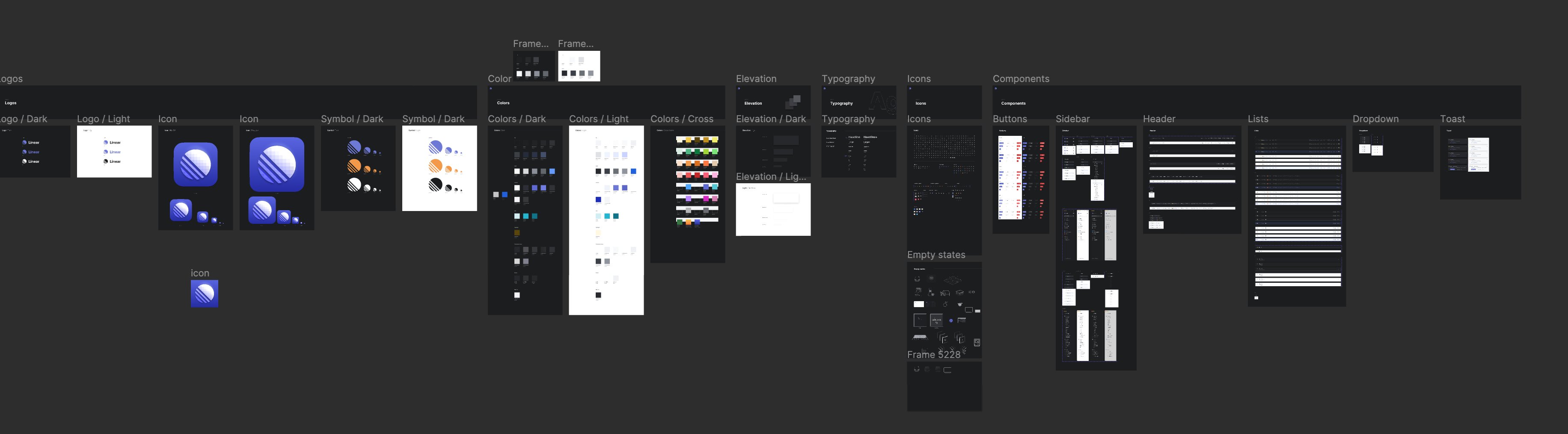
What Kind of Design System Do Startups Need?
Based on my work experience at Zeabur (a startup) and Tencent (in a department with a complete and complex design system), a minimal yet effective design system only needs to focus on these key parts:
Color: The Cornerstone of Everything
A consistent color palette not only provides users with a coherent and unified visual experience but also significantly boosts front-end development efficiency. Therefore, building a color system that is accessible, scalable, and has a unified naming convention is the most critical and thought-intensive step in the entire process.
Color is the DNA of all visual elements. Once the color system is established and widely used, without considering the following points, the cost of later changes will be extremely high, akin to a complete design overhaul. At Zeabur, we encountered the problem that the old color system couldn't support light mode well, the readability of text was not high, and the color steps couldn't be extended well, so we redesigned the color system, which also took a lot of time.
When building a color system, you need to consider the following questions:
-
Brand Expression: How do the colors reflect the product's identity? How do they align with the brand logo and overall feel?
-
Naming Convention: How should the colors be named? Should you use semantic names (e.g.,
$colorPrimary, $colorError) or a functional naming system similar to Tailwind CSS (e.g.,blue-500, gray-900)? The latter often offers better scalability and is more adaptable for multiple themes. -
Color Count & Scalability: How many colors do I need? Will I need to support more colors in the future? How many steps should each color have? Will I need to add more steps later? Oh, by the way, usually gray colors might need more steps because they are often used as different levels of background colors.
-
Multi-Theme Support: How do you plan for switching between Light Mode and Dark Mode? Might you need to support more themes in the future (e.g., custom brand colors for different clients)?
-
Accessibility: How can you ensure the contrast ratio between text and background colors meets WCAG standards to be usable for visually impaired users?
Trust me, a well-thought-out color system will save you an immeasurable amount of time in future iterations.
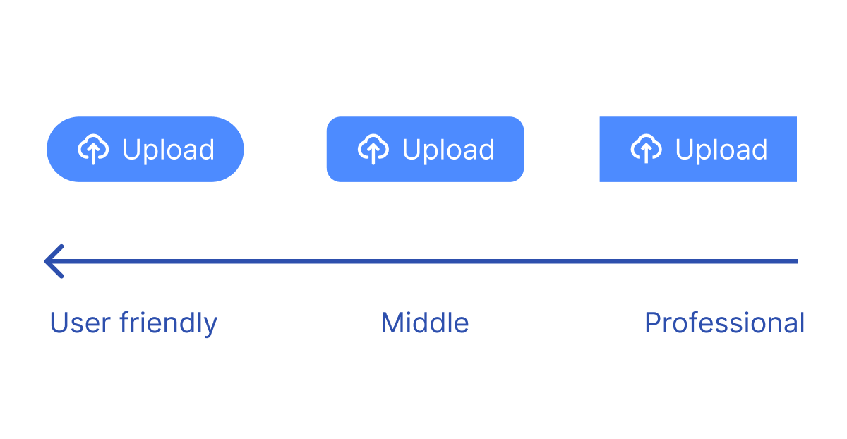
Corner Radius & Icons: A Consistent Silhouette
It might seem surprising to discuss corner radius and icons together, but they jointly define the product's visual silhouette. After color, they are a crucial factor in ensuring a consistent visual experience.
A product's corner radius should be stylistically consistent with the terminal treatment of its icons (i.e., whether they are rounded or sharp). This creates a subtle yet powerful sense of visual harmony.
-
Corner Radius: A larger radius generally creates a friendlier, softer atmosphere, while a smaller or sharper radius conveys a more professional, serious tone. Importantly, you need to unify the corner radius size!
-
Icons: In the early stages of a project, choose a consistent open-source icon library (e.g., Lucide, Feather Icons, or Tabler Icons) and stick with it. The worst mistake is to copy and paste icons from different platforms with varying styles.
Basic Controls: Core Interactions
In the beginning, you don't need to implement dozens of comprehensive components like those in Ant Design or Material Design. You only need to focus on a few of the most frequently used, core controls to build a design system that covers 70-80% of use cases. You can take a look at how Linear manages its design system.
According to my design experience, these basic controls include:
-
Button: Various states (primary, secondary, ghost...) and sizes.
-
Input: Text Input, Textarea.
-
Selection Controls: Checkbox, Radio Button, Switch.
-
Feedback & Alerts: Modal/Dialog, Notification/Toast.
Other high-frequency components specific to your product.
These components are the pivot points of user interaction. Polishing them ensures the core experience of your product is solid.
Typography & Spacing: Information Hierarchy
A startup doesn't need a complex typography system from day one. You just need to start with the most essential text roles to ensure a clear information hierarchy. A minimal typography system should include at least these three levels:
-
Heading: For main page or section titles. It should be the most prominent. You can define 1-2 levels. (e.g., 20px Bold)
-
Body: For most paragraphs, descriptions, and regular text. This is the most common text in the product, and readability is its top priority. (e.g., 14px Regular)
-
Subtle/Secondary: For placeholders, hints, or disabled text states. Its visual weight should be less than the body text. (e.g., 14px Regular, using a dedicated lower-contrast color like gray-500).
As the product becomes more complex, so will the information hierarchy. Your typography system can then evolve naturally:
-
Add more heading levels: Expand from a single Heading to H1, H2, H3...
-
Refine body styles: You might differentiate into Body-Large and Body-Small.
-
Introduce functional styles: Add specialized styles like Link, Caption, or Button-Text.
For spacing, the most effective method is to define a base unit (e.g., 8px) and use multiples of it for all margins and padding (8px, 16px, 24px, 32px...). The benefits are:
-
Reduced Decision-Making: Designers and engineers no longer need to guess between 10px or 12px; they just choose from a predefined scale.
-
Visual Harmony: The relationships between elements become rhythmic and orderly, creating a more visually pleasing layout.
Motion (Optional)
Motion is the easiest part of a design system to overlook, yet it contributes the most to a product's "premium feel." For a startup, the key is to unify the language of motion. This means that when a user interacts with different components, they feel a familiar and predictable rhythm. A minimal motion system only needs to define two core elements: duration and easing curves.
-
Duration: Define a few fixed time values for different scenarios. This prevents engineers from arbitrarily setting 200ms or 300ms.
-
Fast: 100ms - 150ms. For small, immediate feedback like button hovers or icon highlights.
-
Moderate: 200ms - 300ms. For mid-sized element transitions like card expansions or modal pop-ups.
-
Slow: 400ms - 500ms. For large panel transitions, such as a sidebar sliding in and out.
-
-
Easing Curve: Define one or two easing functions to determine the animation's "personality." An ease-in-out curve is a very safe and natural default, as it mimics the acceleration and deceleration of objects in the physical world.
-
Standard Easing: A universal ease-in-out curve for most UI element transitions.
-
Emphatic Easing: A more expressive curve used for moments that need to capture the user's attention, but this can be omitted initially.
-
Other
Finally, here are some small suggestions:
Start with Code: Define global variables directly in your code, and iterate.
Design First, But Don't Over-Engineer: Then, you can create corresponding styles in Figma (maybe because you finally found a designer 😂), but don't get lost in a sea of component variants at the start. Just meet the immediate design needs.
Iterate Continuously: When you notice a new pattern being used repeatedly (like a new card style), it's time to abstract it and make it part of the system. A design system is a living entity that grows naturally with the complexity of your product.
For a startup, the goal of a design system is not to "have a design system," but to ship high-quality products faster and more consistently.